Website Redesign
I finally made the time to redesign my website. And not to toot my own horn, because I am by no means a graphic designer or digital artist, but TOOT TOOT! I think it looks gooooooood. Everything is more visually appealing, but more importantly, it's a better representation of me and my brand.
With the help of a friend and discussing what I wanted my brand to say, we discovered it was simply an extension of me: light-hearted, playful and fun. After coming to this conclusion, the next week was spent playing around with fonts, colors, and design. It's no secret that I am obsessed with color, and color combinations. So figuring out a palette for my logo and website was equally exciting and overwhelming.
Below are just a few photos that I pulled inspiration from.
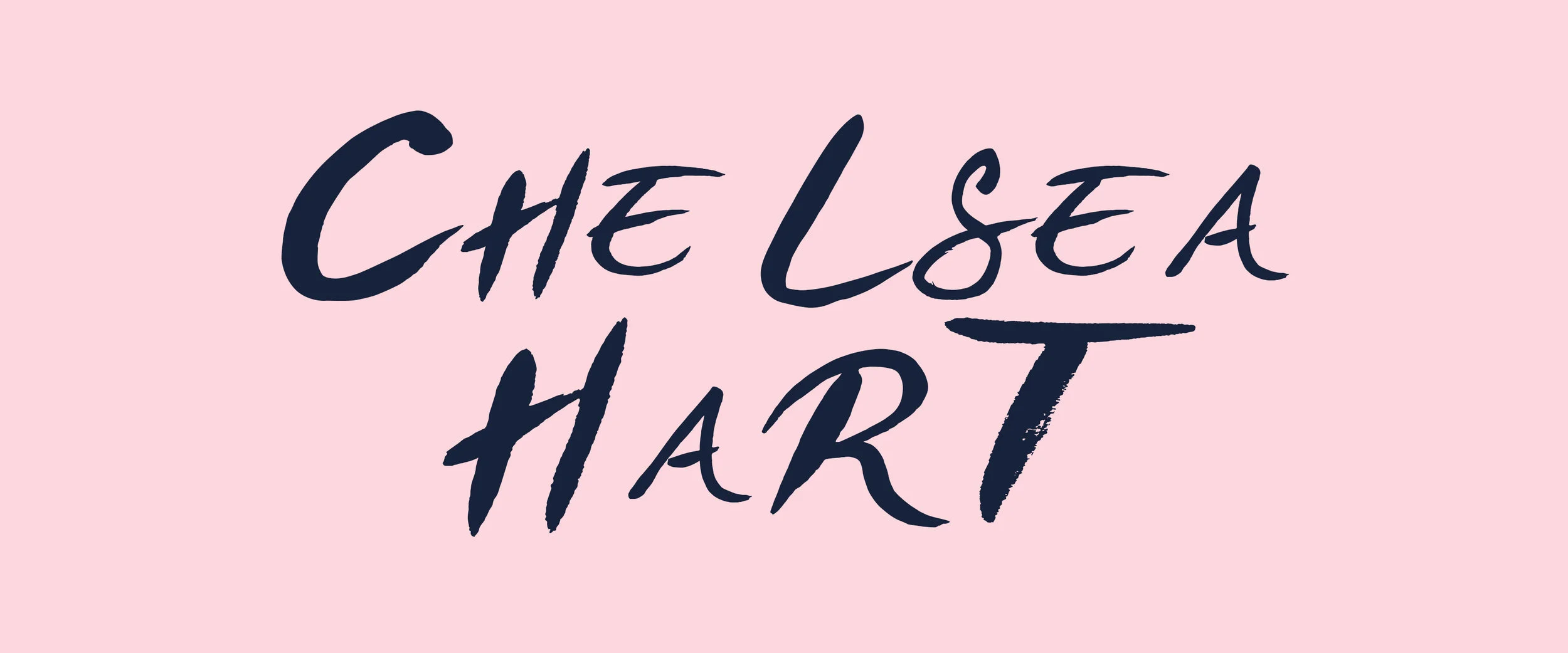
I narrowed it down to a few different color combinations, and found a font that I liked. I went through a few different logo options, none of them ever straying too far from one another, and finally landed on one that felt right.
Simple, fun, and a great reflection of the brand (and me!), Chelsea Hart.
In addition to the overall new look of my website, I also added a few more pages that I am super excited (and nervous) about. One being this very Journal page you're reading now. I'm not much of a writer, and admittedly, words are not my strong suit. It’s also a little scary for me to have a journal where everyone can read my thoughts. Adding a Journal page is something I’ve wanted to do for a while, but I told myself I didn't know what to write about, lacked confidence in my writing skills, or had some other lame excuse. But I decided all those reasons are just keeping me small, and I want you all to know the person behind the paintings, even if my painting skills might be better than my writing, who cares!
Besides the Journal page, you can go check out my About page if you wanna learn more about me, and my Commissions page if you wanna work with me to create a one of a kind painting.


